Interactive timelines are incredibly effective when it comes to presenting massive amounts of data to readers.
People do not like to read anymore. There are numerous studies that show that when people are going to a news sight the story is the last thing their eyes see.
So what do you do to make reading interesting to a visually based society? You make timelines.
When I was told last week to find a few interactive timelines, and compile them into a blog post I wasn't necessarily looking forward to it. I'm a writer. I like to use words. Yet as I started to write I realized that sometimes pieces can get way too wordy. That's when I realized how to effectively utilize the timeline.
If you have massive amounts of data, or are covering a subject that spans many years that is when you realize that you need an effective way to present this much data.
The following are some examples of timelines I found to be exceptional.
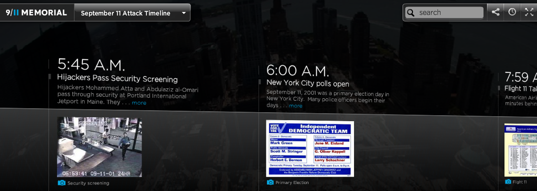
I want to start with the 9/11 memorial timeline. The timeline takes you practically minute by minute through the tragedies of 9/11. I remember 9/11, albeit I was only in fourth grade, but everything seemed surreal to me then. Looking back at it through the timeline I start to feel that surrealness again.
Next I found a rather interesting timeline covering human evolution basically. I choose this as an example because it does a terrific job at presenting loads of data in a very easy to read format. It is the perfect timeline, covering one of the most interesting subjects.
Next I found a timeline that does a very good job at explaining health care reform. I choose this because not only does it cover a very current time, but it also continues into the future, as most of the events of the health care reform bill have not even taken place yet.
For my fourth timeline I choose Aljazeera, and their coverage of the turmoil in Egypt. Once again like many other timelines, this timeline took an overwhelming amount of information and made it so even I could understand it.
I could definitely see how we will use timelines in the O'Brien project, especially considering just the span of information we are going to have. I personally cannot wait to see the final product, and try to present everything I am learning in an easy to understand graphic.
So what do you do to make reading interesting to a visually based society? You make timelines.
When I was told last week to find a few interactive timelines, and compile them into a blog post I wasn't necessarily looking forward to it. I'm a writer. I like to use words. Yet as I started to write I realized that sometimes pieces can get way too wordy. That's when I realized how to effectively utilize the timeline.
If you have massive amounts of data, or are covering a subject that spans many years that is when you realize that you need an effective way to present this much data.
The following are some examples of timelines I found to be exceptional.
I want to start with the 9/11 memorial timeline. The timeline takes you practically minute by minute through the tragedies of 9/11. I remember 9/11, albeit I was only in fourth grade, but everything seemed surreal to me then. Looking back at it through the timeline I start to feel that surrealness again.
Next I found a rather interesting timeline covering human evolution basically. I choose this as an example because it does a terrific job at presenting loads of data in a very easy to read format. It is the perfect timeline, covering one of the most interesting subjects.
Next I found a timeline that does a very good job at explaining health care reform. I choose this because not only does it cover a very current time, but it also continues into the future, as most of the events of the health care reform bill have not even taken place yet.
For my fourth timeline I choose Aljazeera, and their coverage of the turmoil in Egypt. Once again like many other timelines, this timeline took an overwhelming amount of information and made it so even I could understand it.
I could definitely see how we will use timelines in the O'Brien project, especially considering just the span of information we are going to have. I personally cannot wait to see the final product, and try to present everything I am learning in an easy to understand graphic.
 RSS Feed